Designing Air's Calendar Block for clarity and efficiency
How I redesigned Athelas Air’s EMR calendar block to be more informative, responsive, and handle the extraneous needs of the healthcare environment.

Improving our calendar communication was a 3 part project.
How could we...
Below, you’ll see how I tackled each of these challenges, and the process I took to arrive at my final decisions.


To empathize with our user base and truly understand who I was designing for, I spent some time on-site and talking with providers and staff who operate the front desk in their clinic. During my visit, I observed staff move through typical daily activities and discussed common challenges involved with running the front desk.
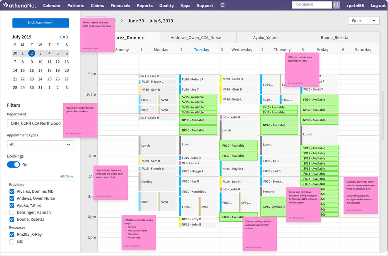
Since I cannot share real images I took, below are representations of the environments we saw.
Front desk staff in small/medium size clinics see anywhere from 40 - 200 patients in a day. In bigger facilities, this can be even higher.
In addition to this, staff must also look out for patients who need special accommodations, take incoming calls from patients, solve insurance issues, and more.

I wanted to capture first hand feedback on what using our current calendar was like, so I talked with various customers in admin/provider rolls and dug into why they were getting frustrated.
This was informative, but in order to really get to core, I needed to dig deeper to find trends and uncover the root causes driving poor user experiences.
To do this, I combined the direct feedback with my own personal and on-site observations, and cleaned up the data into thematic groups I could better summarize.


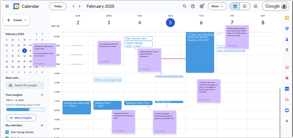
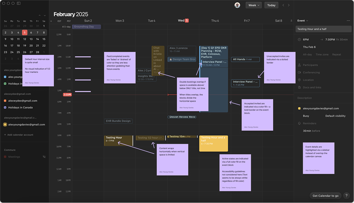
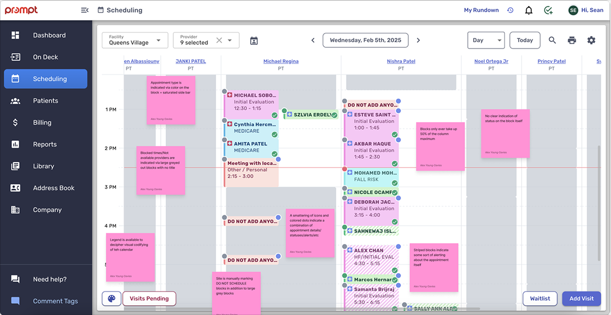
Picking apart everyday calendars (Google, Apple, Notion) would help me determine what make a solid baseline calendar. From there, studying other EMR calendars would help inform me on where we’re falling short and how we can get competitive.


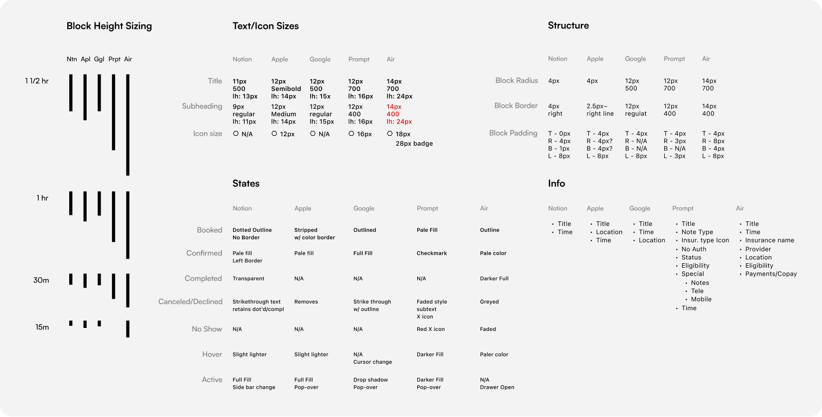


To guide my explorations and ensure I design around what I’d learnt, I pieced together some guiding principles that I could use as north stars in my explorations.


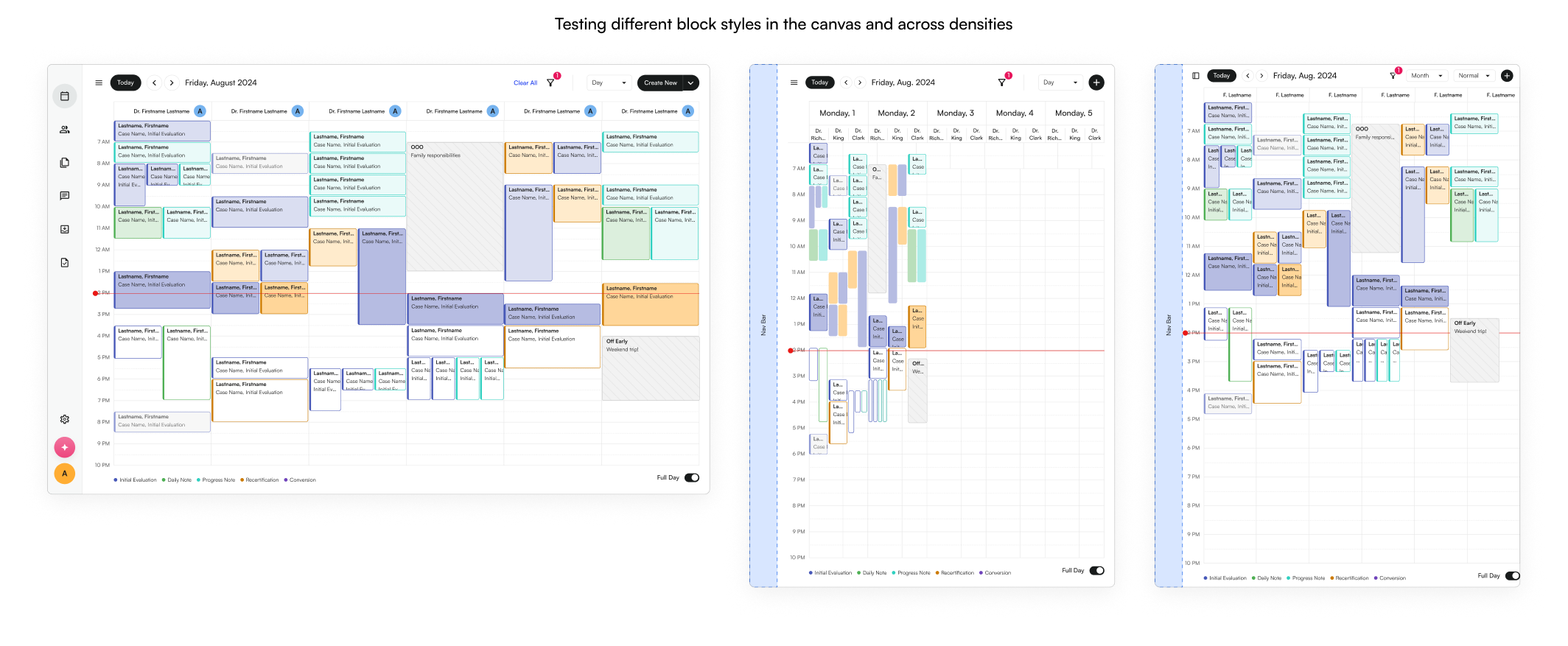


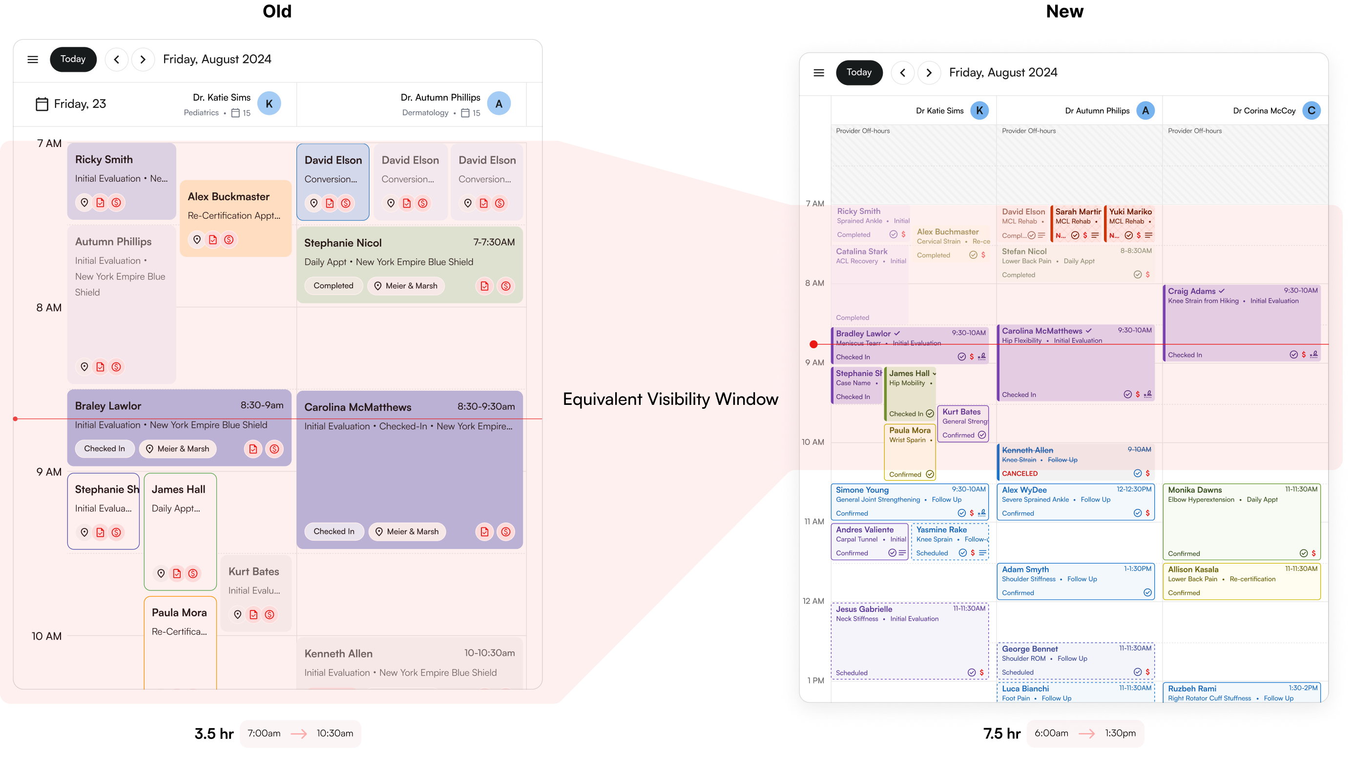
To test the changes in a more rigorous environment, we piloted the new calendar updated with a few customers and documented what we heard.
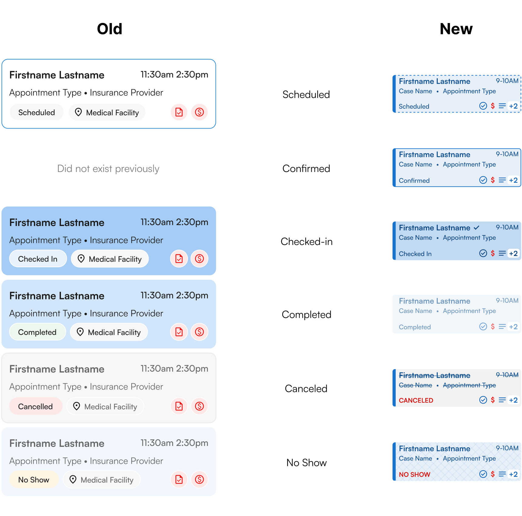
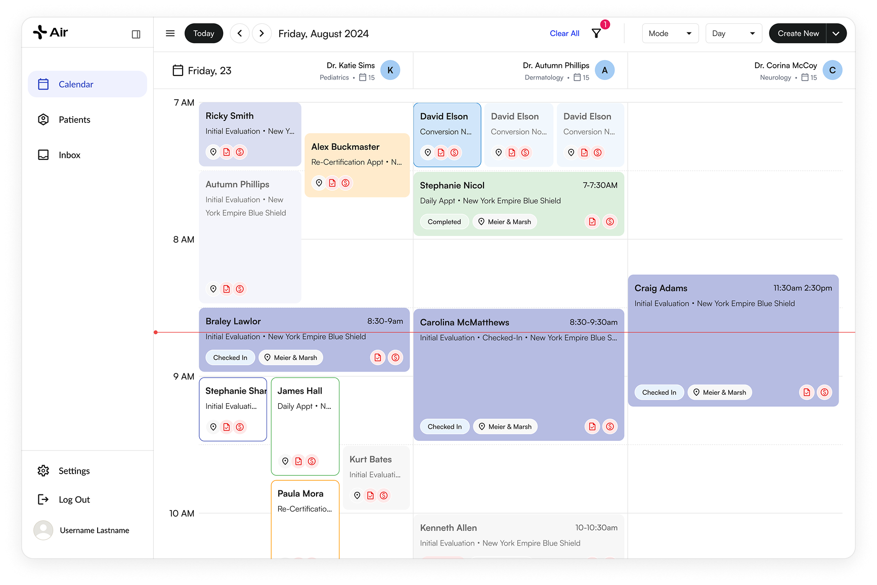
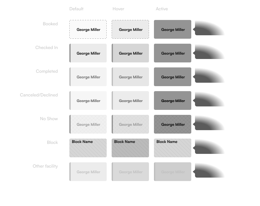
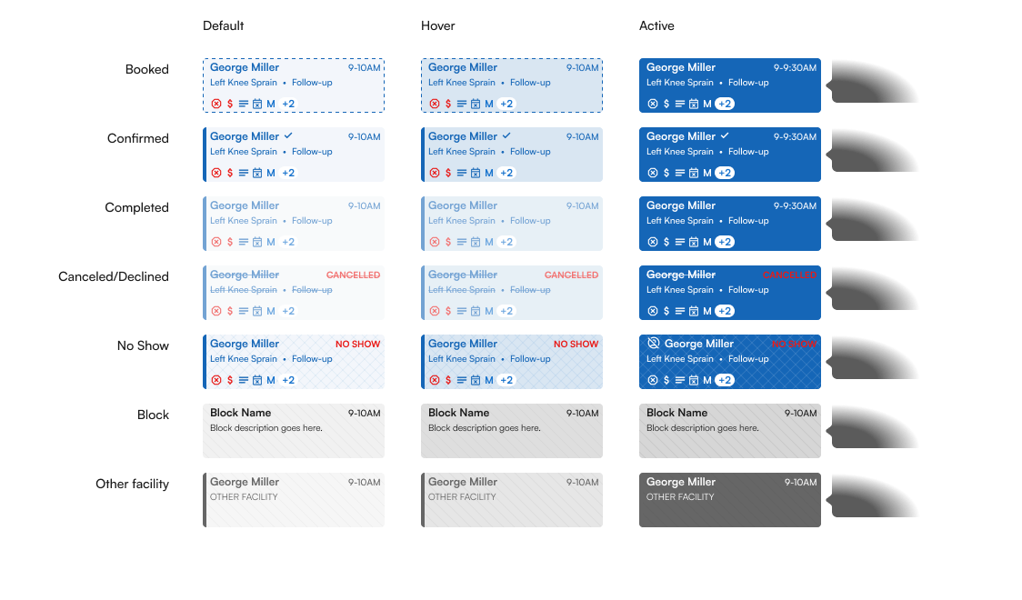
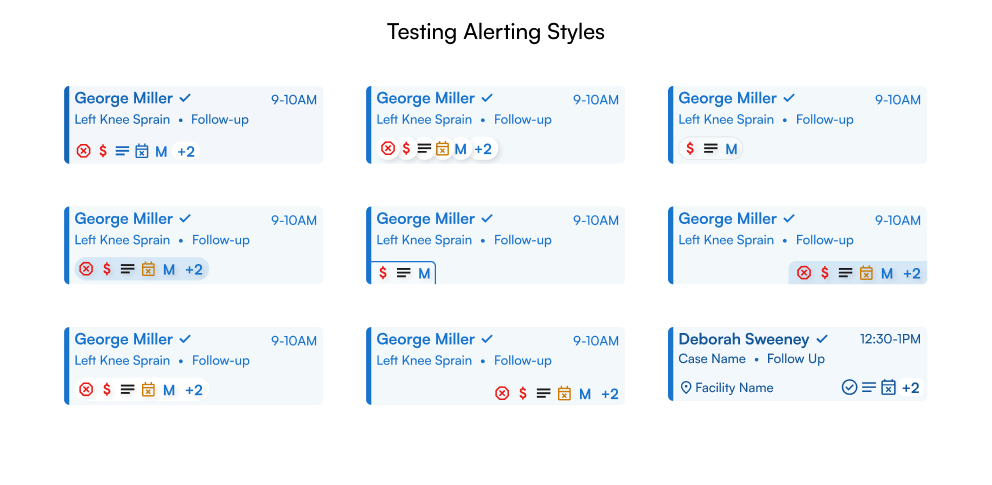
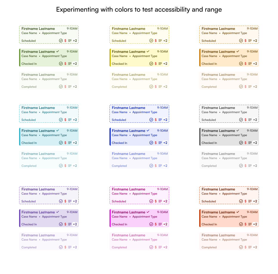
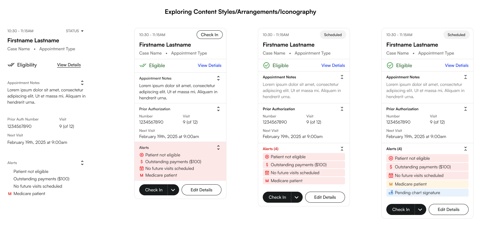
Immediately we heard that some customers were struggling to clearly make out different block colors. We realized this was due to our pastel style approach and many customers using devices which had poor screen contrast ratios.
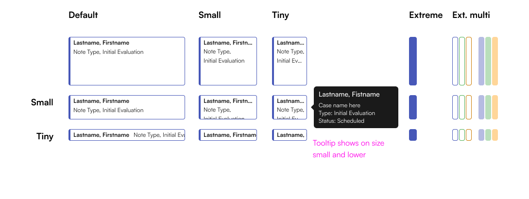
To solve this, I darkened all the block background colors an added the saturated color bar to all statuses. On smaller sizes, the bar got even thicker to ensure clarity.
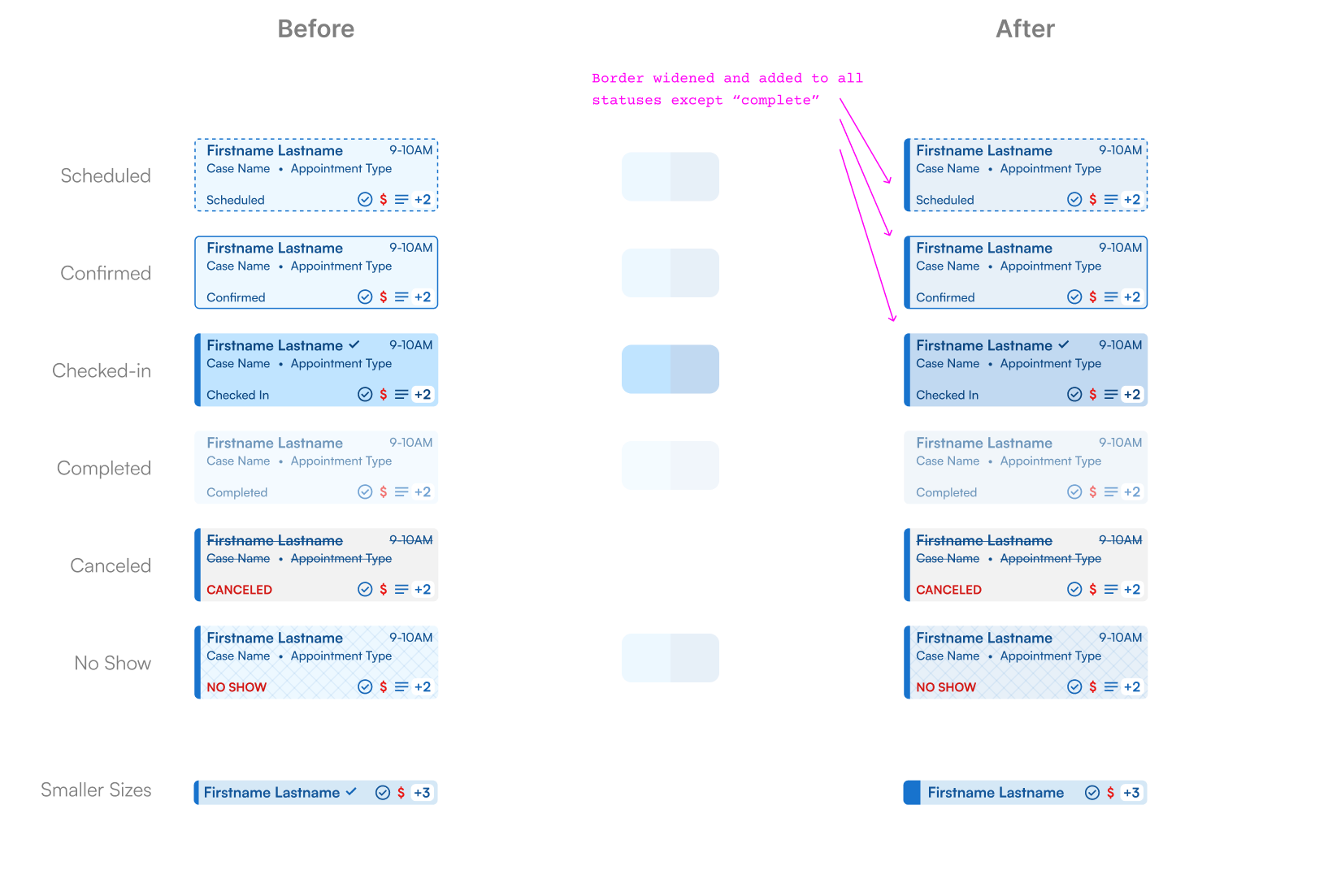
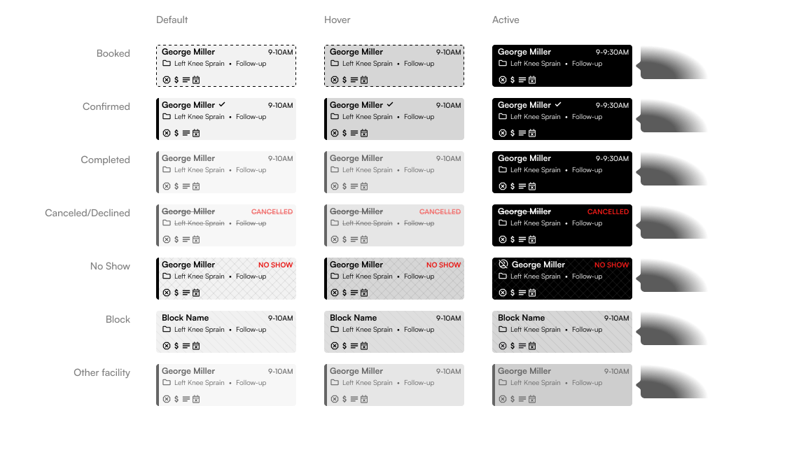
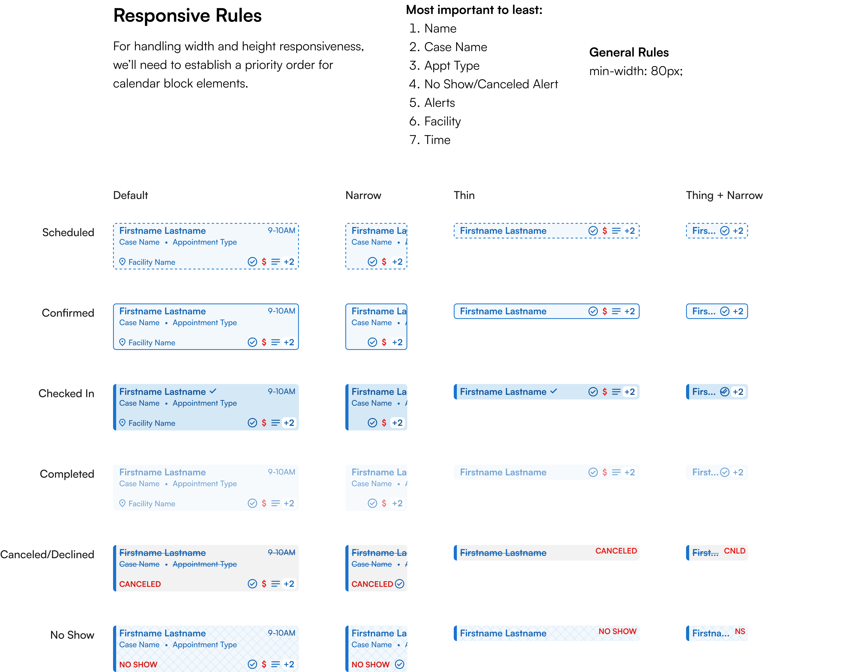
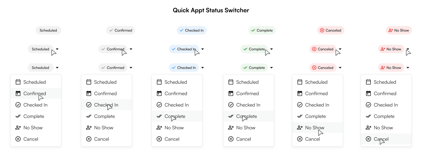
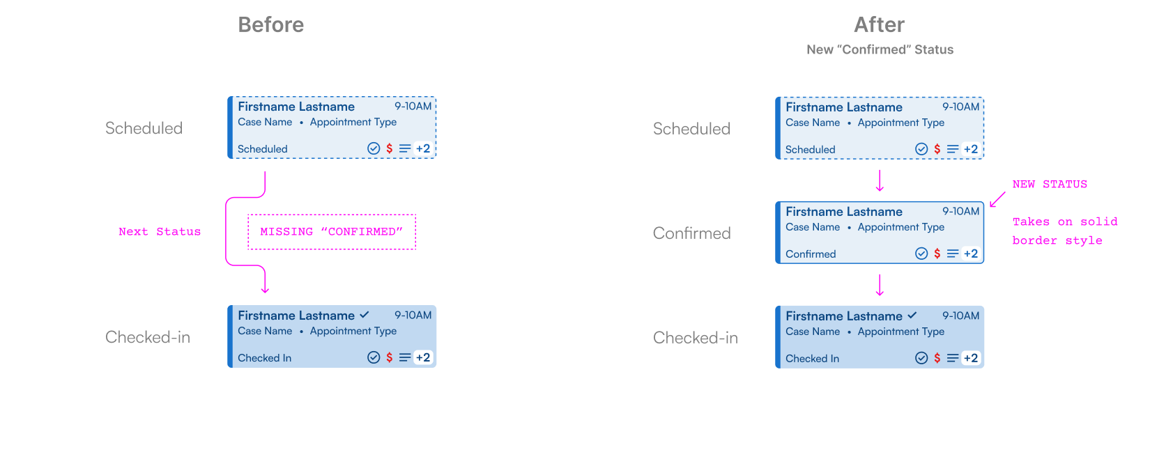
Many sites told us they actually needed an additional status from what we currently had. A new “Confirmed” status would indicate when the patient has confirmed ahead of time that they will arrive for their appointment.
We slotted this status this in and used a solid border to differentiate it from all other statuses.
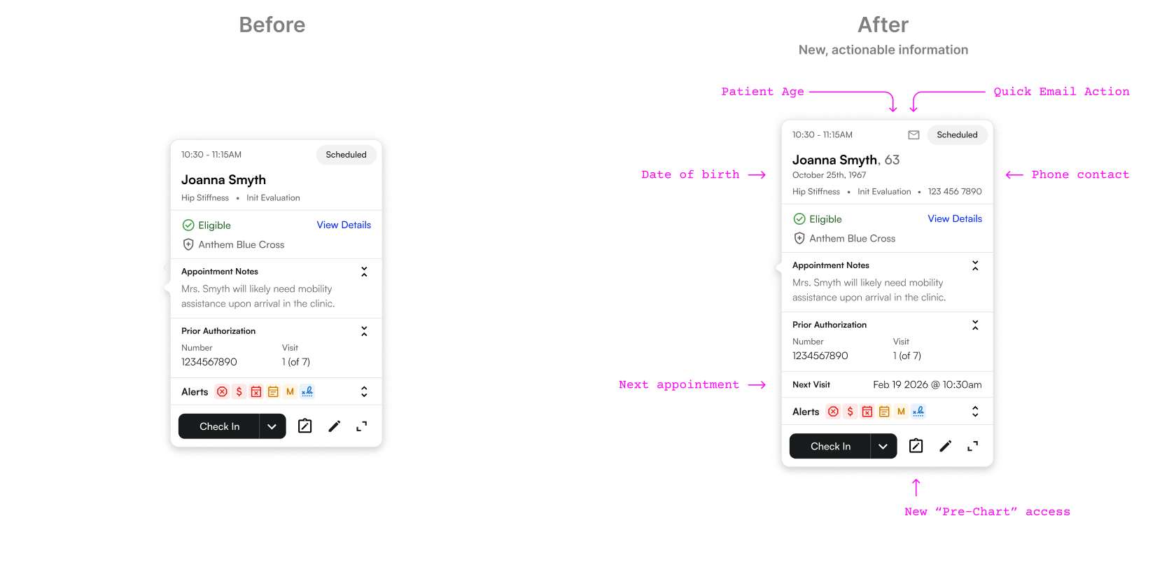
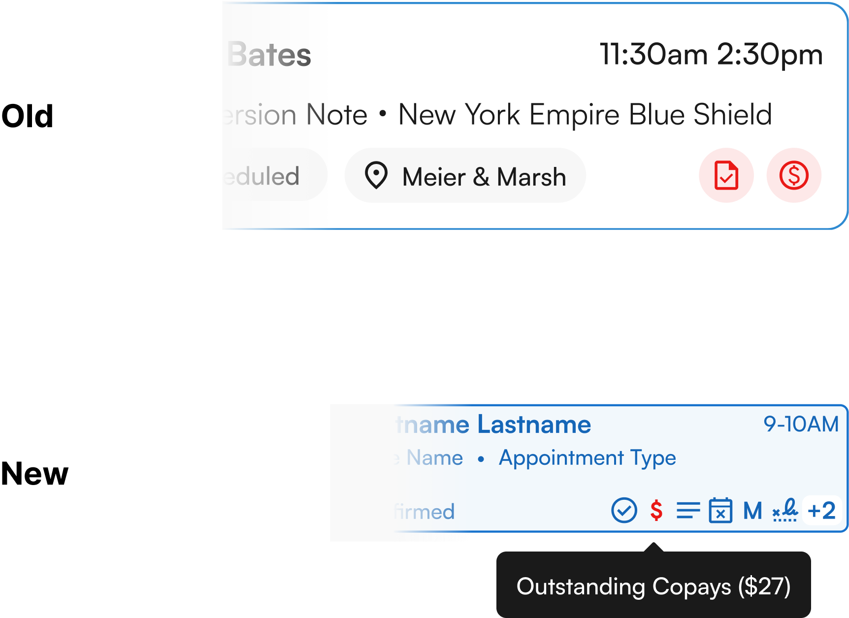
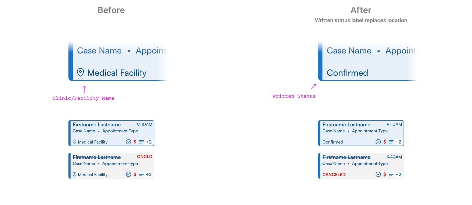
Initially, we’d placed the facility name on the block. We heard this was seen as repeated, low-value information causing noise, plus we soon decided to handle facilities differently on the calendar.
With this label removed, we instead replaced it with a written label of the current status for maximum status clarity.
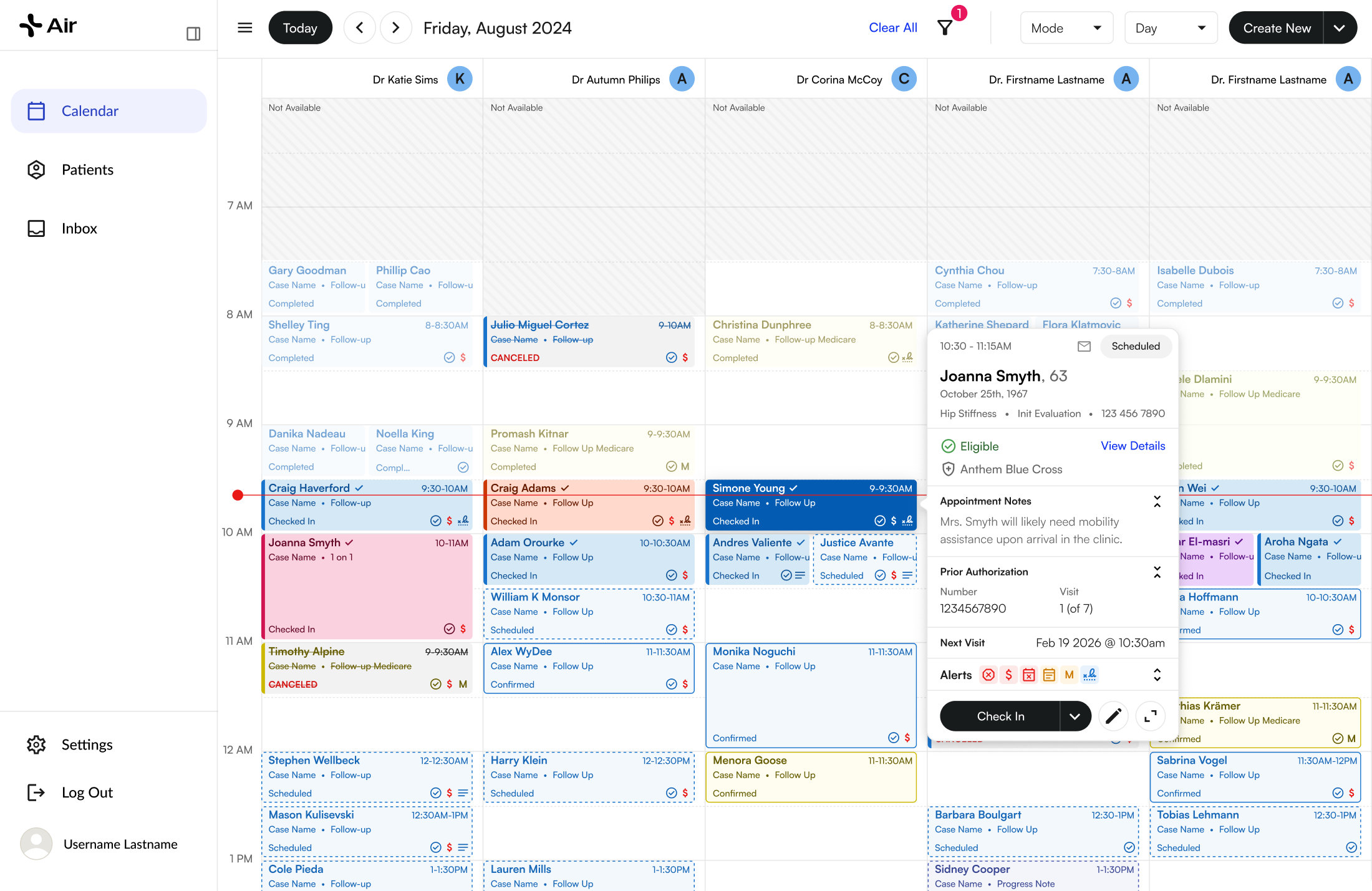
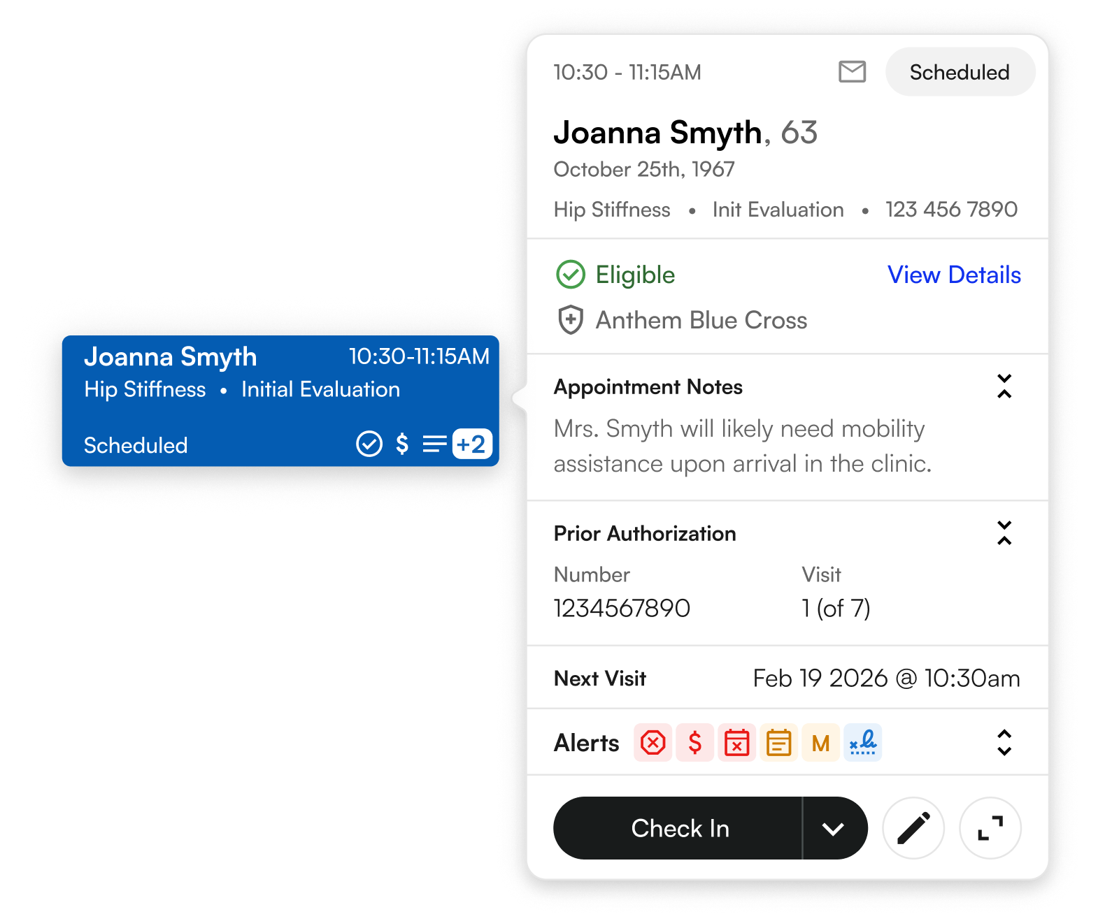
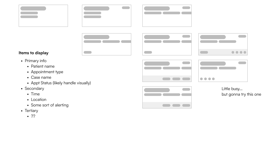
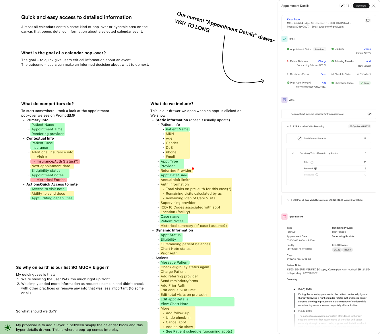
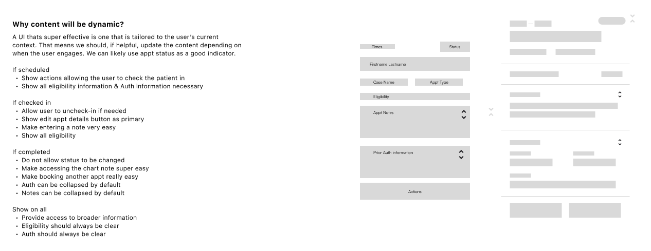
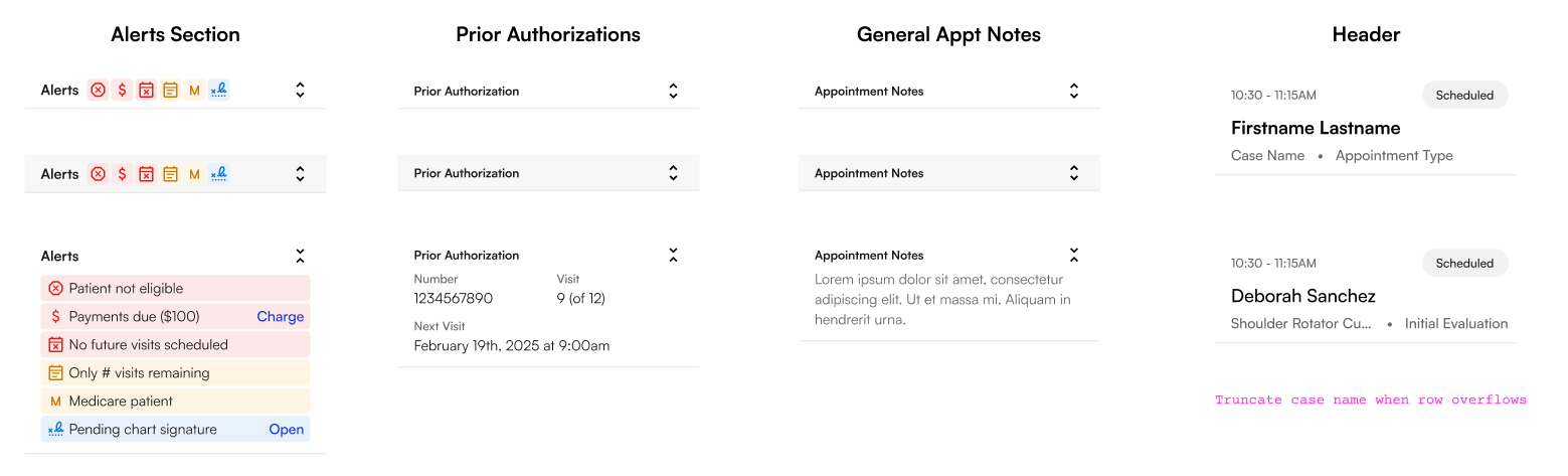
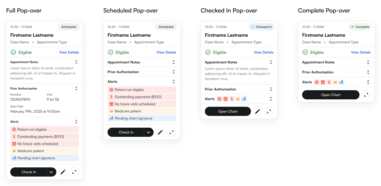
Right after launch, we learnt that a couple key pieces of patient information (such as email, phone, next scheduled visit) were missing from this pop-out window. We needed to add these so staff could easily contact patients when reaching out to confirm their appointments.