Improving search & discovery
on Unplugged.rest
on Unplugged.rest
Redesigning the initial search experience for a getaway cabin on Unplugged.rest to be more engaging, intuitive, and polished.

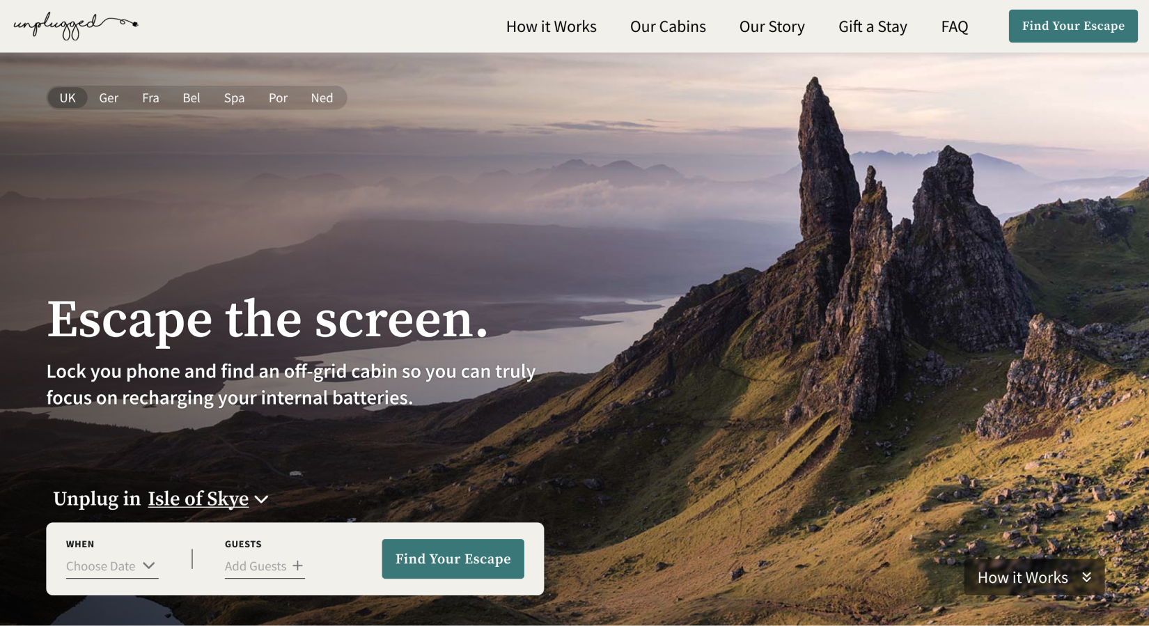
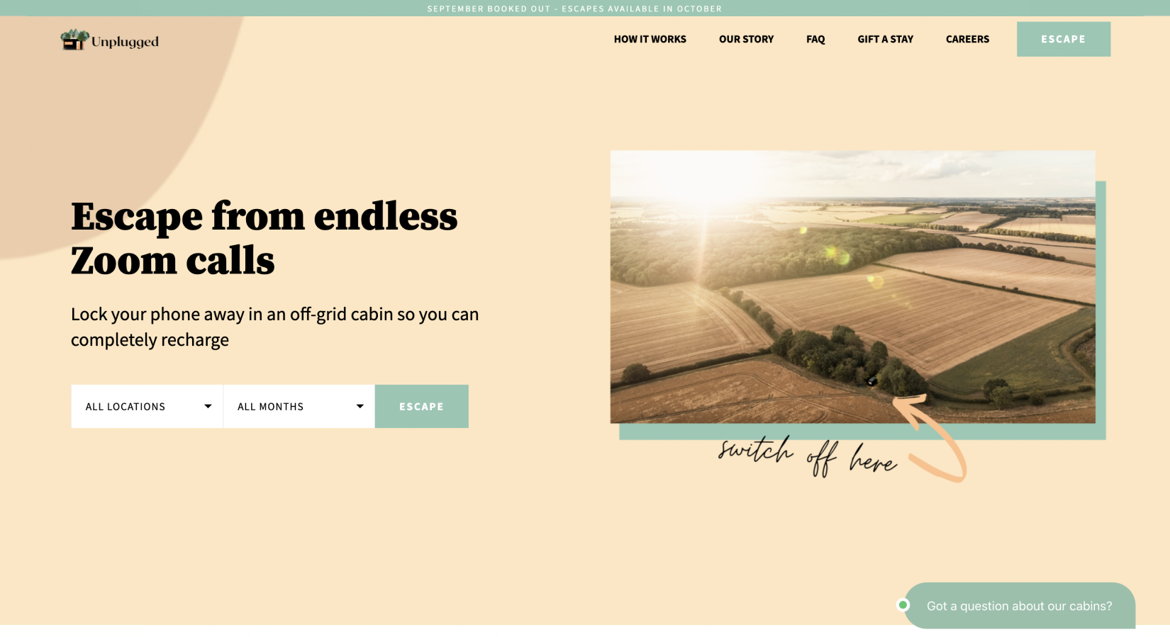
While the cabins themselves offered a great experience, trying to book one on the Unplugged.rest website was challenge. Users were limited to:
Compounding this were cluttered UIs, overly ornate fonts, and vectors in the background, making the whole experience more overwhelming than informative.
The solution
An overhauled the landing page that was more engaging and intuitive to search in, a search results page that presented availability by cabin type, and a new cabin catalog that let customers explore what was available outside of the search experience.
Below, you’ll see how I tackled each of these challenges, and the process I took to arrive at my final decisions.


.png)


The goal of this project was to improve users' experiences, first, with regards to the discovery of cabin options and, second, to build an improved understanding of cabin availability.


When opening the locations filter option...
Users (from outside the UK) are disappointed to find that this business serves only customers near the UK...
Which causes users to leave the website.

When inputting search parameters...
Users are confused as to why the search filters are so vague...
Which causes users to feel unsure about whether or not they’ll be able to find a cabin that fits their desires.
When reviewing the search results (tailored by the vague filters)...
Users were presented with too many options...
Which left users unsure of what they were looking at/what the next steps were. This ultimately caused users to lose interest/patience and leave the website.

When cabin search results are populated by each date of availability...
Users often misunderstand this and assume each search result option is an individual cabin...
Which causes users to become confused when they see repeated pictures, locations, and cabin names.


As shown above, the phases of the user journey are:
For the journey map, I broke each phase down into 6 categories so I could paint a full picture of the user experience at each stage.


.png)

